< A Study in Watercolor for a Home PortraitJoin
Preparation
Materials used:
View info on brushes
9" x 12" cold-press watercolor block
#2B pencil
paints: Red, Yellow, Blue, Burnt Sienna and Burnt Umber
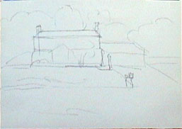
Drawing
For this color study, I first did a simple drawing on 11 by 15-inch watercolor paper. This is an experimental process. I am exploring the color and value relationships between the major subjects in the painting, not addressing the details.
A color study is a process of experimental color composition and value arrangement. It is especially helpful when I need to combine two or more reference pictures for a painting. For example, in a recent watercolor painting commission, my reference pictures were two photos of maple trees, and a picture of a morning scene of the house.
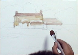
Start from the Main Subject
I started by laying a basic light wash on the house. Then I decided where the clouds would be and washed the sky area with blue, leaving the space where the clouds would be untouched.
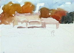
Add Trees Behind the House
I made the trees in various colors. You might worry that there could be too many different colors, but go ahead and try. I laid in the colors for the trees and then moved away from the background. I don’t stay in one area for too long, especially in the beginning stages of a painting.
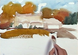
Cover the Front of the House
I mixed yellow and blue with a bit of red for a warm green for the front yard grass, then mixed burnt umber and blue for the warm gray for the driveway and the road.
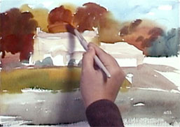
Add Darker Colors and Second Layer to the House
I added darker colors to the trees on the left, middle and the right. I also lightened some areas by lifting off color with my clean 1-inch flat brush. This gives the trees dimension and depth.
I wanted to add a yellow-colored tree in front of the house, so I first lifted off some color at the right of the house, then worked yellow into the area.
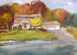
Final Adjustments
I increased definition by introducing the darker lines and shapes and, to make an area warmer, I added a thin red glaze.